
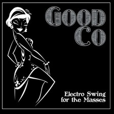
The first digipak I looked at was "Electro Swing for the Masses" by Good Co. It is quite a simple cover which depicts a line drawing of a flapper girl (in rather suggestive clothing), old-fashioned writing which depicts the era and a black background.
The line drawing of the flapper girl clearly depicts that the songs included in this album are most likely more upbeat, which allows the audience to clearly understand what kind of music they can be looking forward to. However, she is quite suggestive which could also connote the kind of electro swing it could possibly contain.
The writing, which is depicted in a typical 1920's to 1950's font, clearly states the timeframe the electro swing is from and makes it clear that the artist as well as the songs will most likely be more old fashioned. Because our album will most likely depict similar songs to Beatophone, which are electronic swing with a twist, we may want to implement a similar font to make the era prominent on the album cover.
Lastly, the black background gives the entire album cover a slick look and through the contrast between the two shades it makes it easier for the audience to understand what is going on. The simplicity of the digipak, however, may be quite boring and may not attract as many people, perhaps even despite being part of the target audience, which is not what we want to be aiming for.
I think that from this album cover we can take some note and perhaps implement some of the elements into our own digipak.

The second digipak which I have taken a liking to is this very simple design, which through the font and simple graphic easily transmits the type of music it could possibly contain. The orange background with the patterns, as well as for the font and the vector make for an interesting composition.
The font is typical for the time frame that this album is attempting to depict. Hence, the digipak connotes that the style of music will most likely be derived from an era roughly 60 to 80 years ago, and therefore may be found in the "Indie" section of a store, or perhaps in the "Oldies" part.
The vector of the mustache and tophat is also relevant to the timeframe that is supposed to be apparent in the tracks given in this track. This kind of connotes that the music is for more elegant occasions, as a tophat, as well as a monocle and a mustache are more formal rather than something else. This could connote more chilled music and therefore doesn't really show the electronic part of the swing music.
The background is old-fashioned in it's pattern, and I feel as if this is a great addition to the otherwise quite simple design. The pattern reminds of old wallpaper, which again, is true to the timeframe.
I feel that maybe using a similar pattern in the background, probably more faded, would be a good addition as we would probably be using a more simplistic design to keep the digipak to be organic.

Whilst this is not necessarily an album cover from the same genre (electro swing), it certainly has some components that I think I would like to include in my digipak design. This image may be showing off the artist, but I feel as if we won't do this. Similarly to this we will add half human, half robot, but instead of a face we would put a hand in place of this.
The only feature of this album cover I think would actually fit is the half-face, half-robot (or what ever it is), as electro swing is kind of old-fashioned with an additional futuristic element. I think that this could be very effective as this is what we are also trying to reach in our music video. Click her eto get to our music video idea.
0 comments:
Post a Comment